How to Style Small Paintings: 4 Proven Display Ideas for Any Space
Estimated read time: 3 minutes
The beauty of small paintings? They're like jewellery for your home - just as the perfect necklace can make an entire outfit feel polished and intentional, a well-styled small painting can create a charming focal point above your kitchen counter or add that finishing touch to your breakfast nook.
Most styling guides focus on large statement pieces, but not everyone has the budget for big art or grand walls! If you've worried that your small art might get overlooked, here's everything I've learnt about making them shine.
What you'll learn:
- How to style small kitchen wall art in 4 different settings
- The impact wall colours have on your artwork
- Essential tips on texture, scale, and height
- Frame considerations for perfect displays
- Quick styling secrets that always work
4 Proven Room Settings for Small Kitchen Wall Art

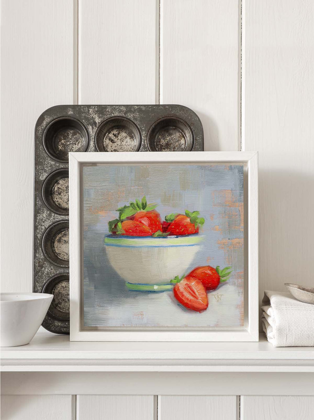
Setting 1: The Sophisticated Kitchen Frame
This sophisticated kitchen styling shows how a small painting can hold its own in formal spaces. In that substantial grey frame, the small painting gains presence and breathing room. The reduced colour palette lets the red strawberries sing against their soft grey background.
Why this works:
- Grey frame creates a gentle spotlight effect
- Neutral surroundings let artwork take centre stage
- Clean styling suits formal spaces
- Proves small paintings work on larger walls

Setting 2: The Colour Echo Display
This has been my favourite technique - and the easiest place to start. Here, the yellow ceramic pot picks up the golden background tones of the nectarine painting, while the red Oxo tin echoes the fruit's warm reds. Everything's surrounded by rich, dark wood with plants reflected in a mirror behind.
Why this works:
- Colours that echo the painting create instant harmony
- Different textures add visual interest
- Layered heights guide the eye around the composition
- Everything feels curated but not precious

Setting 3: The Natural Kitchen Shelf
This feels like the heart of a well-loved kitchen. The raspberry painting nestled amongst cooking implements feels natural and homey, whilst that trailing plant adds lovely organic movement. The mix of smooth ceramics, weathered wood, and fresh green leaves creates a welcoming vignette.
Why this works:
- Natural materials create effortless harmony
- Painting adds colour to practical objects
- Living plants soften edges and bring energy
- Kitchen shelves are brilliant spots for small art

Setting 4: The Casual Lean with Creative Propping
Sometimes the most charming displays happen when we get creative! Here I've used vintage cigar boxes to create perfect height for this peony painting to lean casually. It's relaxed and unprecious, but still intentional.
Why this works:
- Creative propping adds personality and story
- Casual lean feels approachable and lived-in
- Easy to rearrange when you fancy a change
- Everyday objects become styling tools
 The Power of Adding Height
Adding height to your arrangements with taller objects behind or beside your small paintings creates visual depth and interest. Candlesticks, mirrors, or layered objects draw the eye up and make the whole display feel more dynamic, whilst still letting your painting be the star.

Wall Colour: The Game Changer
Have you noticed how your wall colour can completely transform a small painting? Against white walls, colours appear more vibrant and dramatic. But look how beautifully a grey-green wall makes warm fruit tones glow! Darker walls can make small paintings feel more intimate and jewel-like.
If you're renting and can't paint, don't worry - you can create a "colour backdrop" by placing the painting near a coloured object, or even hanging a piece of beautiful fabric behind it.
The Nitty Gritty: Texture, Scale and Height
I love including different textures when styling small paintings: rough against smooth, matte against glossy. The contrast makes both painting and objects more interesting.
Scale relationships matter: a small painting next to a large mirror feels charming and intimate. The same painting, next to a smaller ceramic pot, it feels more substantial.
Height is your secret weapon: books with cloth covers make brilliant pedestals. Simple metal tins add texture and height. Choose something that complements rather than competes.
Frame Considerations Made Simple
For the Tray Frame Lovers: Tray frames give paintings a solid foundation and let them stand proudly on their own - perfect for shelves and mantels.
For Maximum Impact: A more substantial frame creates much more impact if you want the piece to work on a bigger wall.
For the Free Spirits: Small paintings are perfect for leaning - against a backsplash, on a shelf, or propped on a mantelpiece. They're light enough to move around seasonally!
Quick Styling Secrets That Always Work
Pick Up the Painting's Colours: Echo one or two colours from your artwork for harmony without being matchy-matchy.
Odd Numbers Feel Natural: Group in threes or fives - your eye finds this more pleasing.
Follow the Light: Small paintings come alive in good light. Near a window (not direct sun) or under a lamp, colours truly glow.
Add Living Elements: A trailing plant or fresh flowers bring organic movement. Just ensure they don't upstage the painting.
The Bottom Line
Whether you love maximalist joy or minimal serenity, small paintings are wonderfully adaptable. They're not trying to dominate - they're adding little moments of beauty that make a house feel like home.
The best part? There's no wrong way to style them. If the arrangement makes you smile when you walk past, you've nailed it. Trust your instincts and have fun!
Want to add a sprinkle of joy to your space? Browse my collection of small original paintings [here].